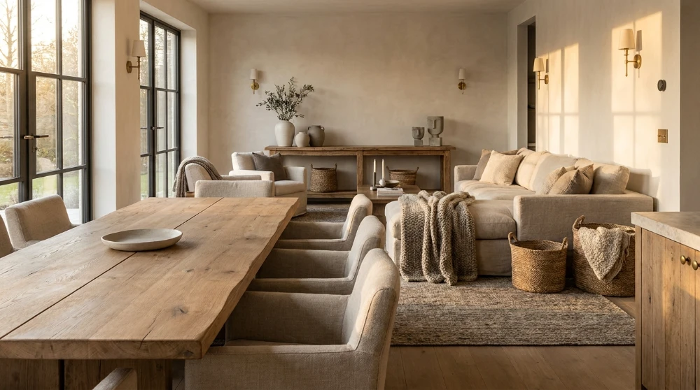
Every room tells a story through the surfaces you choose to live with. Colour palettes shift season after season, driven by trend forecasts that expire before the paint dries. Texture, on the other hand, stays. The grain of a solid wood dining table, the nap of a hand-loomed rug, the cool weight of a ceramic vase: these are the elements that give a space its character long after a trending shade of green has been replaced by terracotta.
This guide breaks down why texture consistently outperforms colour as a design foundation, how to layer tactile elements across different rooms, and what to prioritize when selecting furniture built around material quality.
Why Does Texture Outlast Colour in Interior Design?
What Makes Texture a Timeless Design Element?
Texture engages more than sight. A bouclé armchair, a rough-hewn oak shelf, a linen curtain catching afternoon light: each one adds sensory depth that colour alone cannot replicate. Rooms built on texture feel grounded because the materials themselves carry visual weight, warmth, and dimension without relying on a specific hue.
Colour trends follow cyclical forecasts. A shade popular in 2024 may feel dated by 2027. Texture works differently. Natural wood, woven fibres, stone, and matte ceramics have appeared in interiors for centuries, and they remain relevant because they respond to light, touch, and wear in ways that stay appealing regardless of the current palette.
How Do Colour Trends Create Short-Lived Interiors?
Colour-driven rooms often depend on a single dominant hue to create atmosphere. When that hue falls out of favour, the entire room feels stuck in a specific moment. Repainting walls is straightforward, but replacing a sofa, rug, or set of dining chairs chosen primarily for their colour becomes expensive and wasteful.
Rooms designed around texture avoid this trap. A warm-toned walnut table or a textured jute rug pairs with virtually any colour scheme. The investment holds because the material, not the shade, carries the design.
Warm European Aesthetics and the Shift Toward Tactile Design
The design world has moved away from the minimal, pale Scandinavian look that dominated the 2010s. The current direction leans toward warm European aesthetics: rich wood tones, natural stone, woven textiles, and handcrafted ceramics. This shift prioritizes how a room feels over how it photographs.
For homeowners looking to build spaces with that warm, collected character, brands like Maison Olive offer curated Four Hands collections that emphasize natural materials and artisan craftsmanship. Choosing pieces with genuine tactile presence is what separates a room that looks styled from one that feels like home.
How Does Texture Influence the Way a Room Feels?
Visual Weight vs. Physical Texture
Not all texture needs to be touched to be felt. Visual texture refers to the perceived surface quality of an object: the veining in a marble countertop, the distressed finish on a reclaimed wood console, the ribbed pattern of a hand-thrown ceramic. Physical texture is what you feel when you run your hand across a surface.
Both types work together. A room with only smooth, uniform surfaces feels sterile. Introducing visual contrast through varied finishes, wood grains, and woven patterns creates a sense of richness without adding clutter.
How Do Natural Materials Like Wood and Stone Shape a Room’s Mood?
Solid wood carries warmth. It absorbs and reflects light differently depending on the grain, the finish, and the time of day. A mango wood sideboard reads differently at noon than it does under evening lamp light, and that dynamism is part of what makes natural materials compelling.
Stone and concrete introduce coolness and weight. Pairing these harder surfaces with softer elements like linen, wool, or cotton creates a push-pull effect that keeps a room from feeling one-dimensional. The interplay between warm and cool, rough and smooth, is the foundation of textured design.
The Role of Contrast in Creating Depth
Depth comes from opposition. A smooth leather chair next to a rough stone fireplace. A polished brass lamp on a raw wood shelf. These contrasts force the eye to move through a space, registering each surface individually before taking in the whole.
Rooms that lack textural contrast tend to flatten visually, even when the colour palette is well chosen. Introducing 3 to 4 distinct textures per room is a reliable baseline for creating visual interest without overwhelming the space.
What Are the Best Ways to Layer Texture in an Open-Concept Space?
Grounding a Room With Statement Furniture
In open-concept layouts, furniture does the work that walls do in traditional rooms: it defines zones and sets the tone. A solid wood dining table with visible grain becomes the anchor for a dining area. A textured upholstered sofa marks the living zone. These pieces need enough material presence to hold their own in a larger, boundary-free space.
Statement furniture works best when the texture is inherent to the material, not applied as a surface treatment. Reclaimed wood, hand-finished metal, and natural stone age in ways that synthetic alternatives cannot.
How Do Rugs and Textiles Add Warmth Without Clutter?
Rugs are the fastest way to introduce texture into any room. A hand-knotted wool rug under a coffee table adds warmth, defines the seating area, and introduces a tactile layer that hard flooring lacks. Layering a smaller patterned rug over a larger neutral one adds further dimension.
Textiles like throw blankets, linen cushions, and woven baskets serve the same function on a smaller scale. The key is variation: mixing weave types, fibre weights, and finishes so the eye registers each layer individually.
Mixing Raw and Refined Finishes for Balance
Too much raw texture (rough wood, unglazed clay, burlap) can make a room feel unfinished. Too much refinement (polished metal, glossy lacquer, smooth marble) can feel cold. The goal is balance.
Pair a rough-sawn oak dining table with polished brass candleholders. Set matte ceramic bowls on a smooth marble countertop. Place a chunky knit throw on a sleek leather sofa. Each pairing creates a micro-contrast that adds interest to the space.
Which Textures Work Best in Every Room?
Living Room: Solid Wood, Linen, and Woven Accents
The living room is where texture has the most room to breathe. Start with a substantial piece of solid wood furniture: a coffee table, media console, or bookshelf. Layer in linen or cotton upholstery for seating, and add woven accents through baskets, cushion covers, or a textured area rug.
Avoid uniformity. If the sofa is smooth, the throw pillows should be textured. If the rug is flat-woven, the blanket draped over the armrest should have visible knit or weave.
Bedroom: Upholstered Headboards, Natural Fibre Rugs, and Soft Lighting
The bedroom benefits from softer textures concentrated around the bed. An upholstered headboard in linen or velvet sets the tone. Layered bedding in mixed fabrics (cotton percale sheets, a linen duvet cover, a wool throw at the foot) creates a bed that looks and feels inviting.
Underfoot, a natural fibre rug (wool, jute, or a wool-jute blend) softens the transition from floor to bed. Lighting matters here too: fabric lampshades diffuse light in a way that glass or metal shades do not, adding another subtle textural layer.
Kitchen and Dining: Reclaimed Wood Tables, Matte Ceramics, and Brass Details
Kitchens tend toward hard, reflective surfaces: tile, stainless steel, glass. Introducing texture through the dining table, open shelving, or countertop accessories offsets that coldness.
A reclaimed wood or solid hardwood dining table is the most impactful single addition. Matte ceramic dishware, hand-thrown pottery, and woven placemats bring warmth to the table setting. Small brass or iron hardware details on cabinetry or light fixtures complete the textural palette without competing for attention.
How to Choose Quality Furniture That Prioritizes Texture
What Should You Look for in Handcrafted Furniture?
Handcrafted furniture carries marks of its making: slight grain variations, hand-applied finishes, joinery details visible at close range. These are not flaws. They are signals of material authenticity and construction quality.
When evaluating a piece, look at the wood species and grain pattern, the type of finish (oil, wax, lacquer), and the joinery method (mortise and tenon, dovetail, dowel). Solid wood construction holds up to decades of use and develops a patina that improves with time.
Why Material Origin and Construction Technique Matter
A table made from kiln-dried mango wood behaves differently from one made of particleboard with a veneer finish. The solid wood version responds to its environment, develops character with use, and can be refinished multiple times. The veneer version degrades and cannot be repaired.
Knowing the material origin and construction technique helps separate furniture that lasts from furniture that is designed to be replaced. Investing in pieces with transparent sourcing and proven construction methods pays off over years of daily use.
Investing in Pieces That Age Well
The best textured furniture improves with time. Leather develops a patina. Solid wood darkens and softens. Brass oxidizes to a warm glow. These changes are part of the design, not signs of deterioration.
Choosing pieces that age well means selecting materials that respond to use rather than resist it. Synthetic finishes and engineered surfaces maintain a static appearance until they chip or peel. Natural materials evolve, and that evolution is what keeps a room feeling alive years after it was first designed.
Key Takeaways for Building a Texture-Rich Home
Colour gets the attention, but texture does the heavy lifting. A room built on tactile depth, natural materials, and varied finishes will feel relevant and inviting long after the trending palette has changed.
Start with 1 or 2 anchor pieces in solid, natural materials. Layer in textiles and smaller accessories to build contrast. Mix raw and refined finishes so no single surface dominates. Prioritize material quality over colour matching, and choose pieces that age into a room rather than out of it.
The result is a home that feels collected, warm, and genuinely personal, no trend cycle required.
Frequently Asked Questions About Texture in Interior Design
Texture works in both, but it becomes most visible in neutral palettes. When colour is dialled back, the eye naturally focuses on surface quality: the grain of wood, the weave of fabric, the sheen of metal. In colourful rooms, texture adds a supporting layer of depth that prevents the space from feeling flat or one-dimensional.
Focus on fewer, higher-impact pieces. A single statement rug, a solid wood side table, and a pair of textured cushions can transform a minimalist room without disrupting its clean lines. The key is choosing materials with strong visual and physical texture so each piece carries enough weight on its own.
Visual texture is what the eye perceives: the pattern in marble, the grain in wood, the ribbing in a ceramic glaze. Tactile texture is what the hand feels: the roughness of linen, the smoothness of polished stone, the softness of velvet. The most compelling interiors layer both types, creating spaces that look rich and feel comfortable.


