There’s something about a Pottery Barn office that feels timeless. It’s that blend of rich wood tones, cozy textures, and practical design that makes you want to sit down and get things done. For years, Pottery Barn has set the standard for home office inspiration. Their furniture and decor carry that rustic-yet-polished appeal—something that balances elegance with functionality.
Whether you’re carving out a corner of your living room for remote work or transforming a dedicated room into a professional workspace, Pottery Barn offers endless inspiration. But creating a Pottery Barn office isn’t just about buying their catalog. It’s about embracing their design philosophy and blending it with your personality, space, and budget.
Pottery Barn Office Furniture
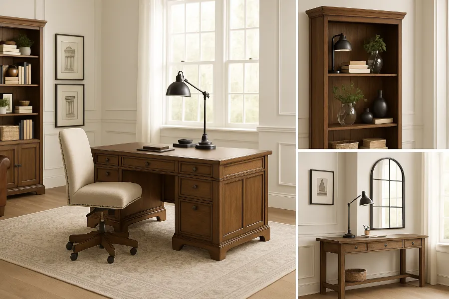
Desks
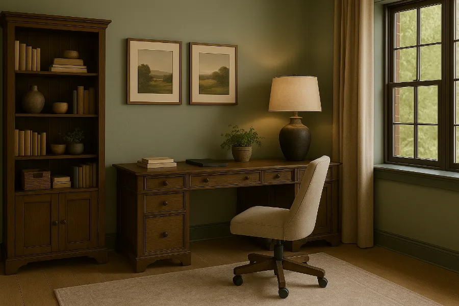
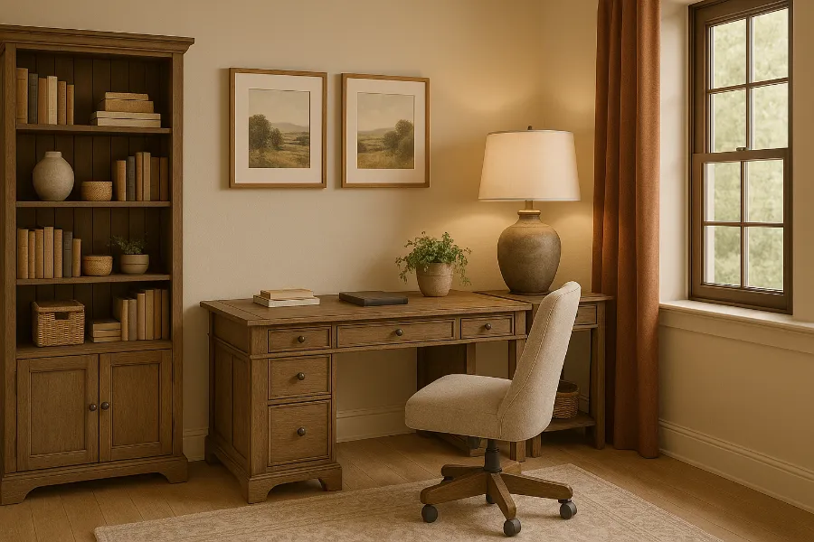
The desk is the heart of any office, and Pottery Barn nails it with options that feel both substantial and stylish. Their Livingston Executive Desk is a favorite—a grand piece with plenty of storage and a polished design. For smaller rooms, the Printer’s Desk offers modular configurations that adapt to your needs. If you’re into more modern living, Pottery Barn also offers standing desk solutions that keep wellness in mind.
When shopping or styling for a Pottery Barn-inspired office, focus on pieces that combine durability with versatility. Solid wood and timeless finishes are key. Look for details like carved legs, rich stains, and ample drawers.
Chairs
No office is complete without the right chair. Pottery Barn’s leather armchairs and upholstered task chairs combine comfort with elegance. Their Colton Leather Armchair, for example, doubles as a reading chair while maintaining a professional presence. If you want something more functional for long workdays, the upholstered swivel chairs bring ergonomic support without sacrificing style.
Storage Solutions
A Pottery Barn office isn’t just about looks—it’s about organization. Bookshelves, lateral file cabinets, and glass-front hutches keep clutter in check while adding visual interest. Their Livingston Bookcase is iconic, offering adjustable shelves and timeless craftsmanship. To mimic this style affordably, look for clean-lined shelving with a rustic finish, and accessorize with baskets or storage boxes.
Pottery Barn Office Decor
Lighting
Lighting sets the tone in any office. Pottery Barn’s Genoa Wooden Floor Lamp or Skylar Desk Lamp combine rustic finishes with functional lighting. For a dramatic effect, chandeliers or pendant lighting can instantly elevate a workspace.
Rugs, Curtains, and Textiles
Warm, textured rugs anchor the room and soften the space. Neutral tones, natural fibers, or subtle patterns work well in a Pottery Barn office. Curtains should frame windows without overpowering—linen drapes in soft shades keep things airy and bright.
Wall Art and Accents
Mirrors, framed black-and-white prints, and rustic wall clocks are staples of the Pottery Barn look. Don’t overlook accessories: a bar cart repurposed as an office accent, tufted ottomans that double as storage, or even nautical-inspired pillows can add personality.
Designing Your Pottery Barn Office Space
Small Office Solutions
Not every home has space for a full executive suite. Pottery Barn proves that even compact corners can feel intentional. Use a narrow console table as a desk, or try a secretary desk that folds away. Floating shelves keep vertical storage practical while freeing up floor space.
Large Office Layouts
If you have room to spare, go bold. Anchor the room with an oversized executive desk, then flank it with tall bookcases. Add a reading nook with a leather armchair and a floor lamp. Incorporating symmetry—like matching cabinets on each side—creates that polished Pottery Barn balance.
Shared Office Spaces
For couples or families working together, Pottery Barn has modular double desks that make collaboration easy. Pair them with matching chairs for cohesion, but personalize with individual lighting and decor.
Tips for Styling a Pottery Barn Office
- Mix Old and New: Pottery Barn thrives on rustic textures paired with polished finishes. Mix reclaimed wood with sleek leather.
- Prioritize Comfort: Add upholstered seating, soft rugs, and layered textiles to keep the office inviting.
- Keep Function First: A Pottery Barn office looks beautiful because it works beautifully. Prioritize storage and layout before layering in decor.
- Color Palettes: Neutrals rule the Pottery Barn aesthetic—creams, grays, browns, and blues. Accent with metallic finishes like brass or black iron.
Where to Shop and How to Budget
Pottery Barn Stores vs. Online
Shopping in-store gives you a tactile experience, but Pottery Barn’s online catalog is extensive and often offers online exclusives. The benefit of online shopping is access to reviews, which help you decide on investment pieces.
Seasonal Sales
Pottery Barn frequently offers seasonal discounts—especially during holiday weekends. Their Design Rush Sale and clearance events are prime times to grab statement furniture without overspending.
Investment vs. Budget-Friendly
If your budget is limited, focus on investment pieces like desks and chairs. Then, balance with affordable dupes for accents—Wayfair, Target, or Overstock often carry Pottery Barn-inspired decor at a fraction of the price. The key is blending to create the overall look.
Final Thoughts on Pottery Barn Office
A Pottery Barn office is more than just furniture—it’s an atmosphere. It’s about creating a workspace that feels refined yet lived-in, professional yet personal. By focusing on durable furniture, thoughtful decor, and clever layouts, you can bring the Pottery Barn aesthetic into your home—whether you shop their catalog directly or mix in budget-friendly alternatives.
At the end of the day, your office should inspire you to sit down, stay focused, and maybe even smile while working. Pottery Barn’s style gives you that perfect blend of warmth and sophistication, ensuring your workspace is not just productive but also beautiful.


")


