Interior paint colors can transform your home more than almost any other design choice. A single coat of paint can brighten a dark corner, calm a busy mind, or energize a dull space. It’s one of the most affordable and effective ways to refresh your interiors, yet it’s also one of the trickiest decisions homeowners face. With thousands of options and endless undertones, how do you pick the perfect shade?
Let’s dive into how to choose interior paint colors with confidence, explore timeless and trendy hues, and learn strategies to test them before committing.
Choosing the Right Interior Paint Colors for Your Space
The first rule of choosing interior paint colors is simple: paint doesn’t live in isolation. The color you fall in love with on a swatch or Pinterest board may look completely different once it’s on your wall. That’s because light, décor, and even flooring dramatically influence how a color is perceived.
Consider Lighting
- Natural light: North-facing rooms tend to make colors look cooler, while south-facing light adds warmth.
- Artificial light: LED, incandescent, and fluorescent bulbs all shift undertones differently. Always test your paint color under the actual lighting you’ll use.
Match with Décor and Furniture
Paint should complement your existing style, not fight against it. For example:
- Warm beiges pair beautifully with wood tones.
- Crisp whites highlight modern furnishings.
- Soft blues balance darker furniture.
Popular Interior Paint Colors and Trends
Some paint colors are classics that never go out of style, while others are having a well-deserved moment. Here’s a breakdown:
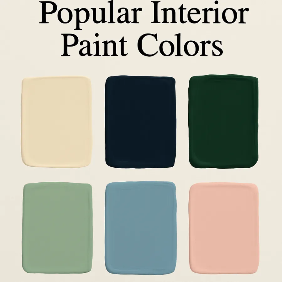
Timeless Neutrals
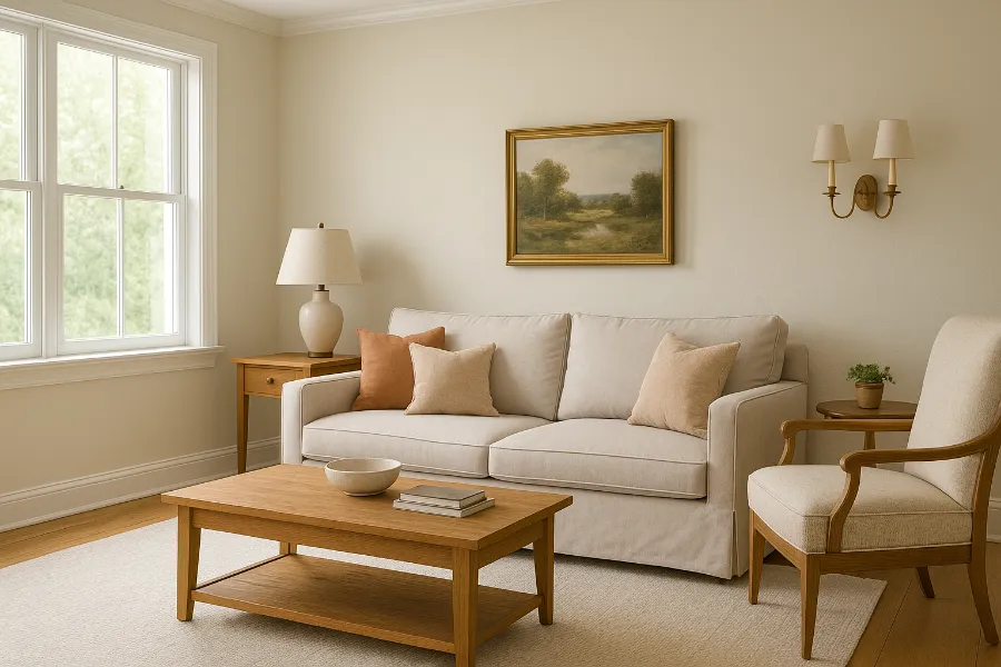
- White Dove (Benjamin Moore): A soft, creamy white that works everywhere.
- Revere Pewter (Benjamin Moore): The go-to greige, balancing warm and cool tones.
- Tapestry Beige (Benjamin Moore): A versatile, warm neutral perfect for open floor plans.
Bold Accent Colors
- Navy Blue: A strong, grounding choice for offices, dining rooms, or accent walls.
- Emerald Green: Luxurious and moody, great for statement rooms.
- Terracotta: Warm and earthy, ideal for cozy living spaces.
Soft Calming Tones
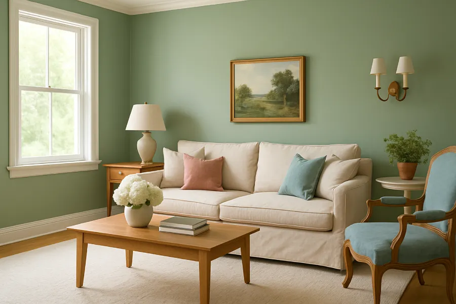
- Sage Green: Brings nature indoors, perfect for bedrooms or kitchens.
- Dusty Blue: Relaxing and versatile, works well in bathrooms or living rooms.
- Blush Pink: Soft and sophisticated, pairs beautifully with neutrals.
The Psychology of Interior Paint Colors
Paint isn’t just about looks—it shapes how a space feels.
Warm vs. Cool Tones
- Warm tones (reds, oranges, yellows): Energize, inspire conversation, and make large rooms feel cozier.
- Cool tones (blues, greens, purples): Calm, relax, and expand smaller spaces.
Colors by Room
- Living Room: Warm neutrals or soft greens to encourage relaxation and conversation.
- Bedroom: Blues and muted greens for restfulness; soft blushes for a cozy feel.
- Kitchen: Whites and creams for brightness, or sage greens for a modern twist.
- Home Office: Navy or charcoal for focus, pale green for clarity.
Tips for Testing Interior Paint Colors Before Committing
Never skip this step—it’s the secret to avoiding paint regret.
- Use Large Swatches: Don’t rely on tiny chips. Try peel-and-stick samples or paint a poster board with two coats.
- View at Different Times of Day: Morning sunlight, evening shadows, and artificial light all change the tone.
- Check Against Trim: Your wall color should work with ceiling and trim shades, often painted in crisp whites like Simply White (Benjamin Moore).
Consider the Finish
- Matte/Flat: Hides imperfections, but less durable.
- Eggshell/Satin: A good balance for most walls.
- Semi-gloss/Gloss: Best for trim, doors, and areas that need easy cleaning.
Mistakes to Avoid When Choosing Interior Paint Colors
Even with the best intentions, it’s easy to make mistakes. Here are the most common ones:
- Ignoring Undertones: Beige can read pink, yellow, or gray depending on the undertone.
- Choosing Trend Over Timeless: A bold choice might feel fresh now but look dated in a few years.
- Painting Without Testing: Skipping samples almost always leads to regret.
- Forgetting Cohesion: Your entire home should flow. Colors don’t need to match, but they should complement each other.
Bringing It All Together
Choosing interior paint colors is part science, part art, and part gut instinct. Start by narrowing down what mood you want the room to have, test your choices in real light, and always think about how they interact with your existing furnishings. With a little thought and patience, you’ll land on colors that make your home feel refreshed, intentional, and uniquely yours.
Interior paint colors are one of the simplest yet most powerful tools in home design. Whether you go for timeless neutrals, bold accents, or soft calming tones, the right paint color sets the stage for how you live and feel in your space. Happy painting!