Staring at a blank wall can feel oddly stressful. There it is, just sitting there, waiting for you to do something brilliant with it. And so, in a moment of panic, many of us do exactly the wrong thing: we buy too much, hang too much, and suddenly that once-empty wall looks chaotic instead of curated.
The fear of emptiness drives us to overdecorate. We layer frames, mix clashing styles, and add shelves stuffed with trinkets until the wall screams for mercy. But here is the truth: a blank wall is not a problem to solve. It is an opportunity to create something beautiful, intentional, and genuinely calm.
This guide will walk you through practical, stress-free strategies for decorating your walls without creating visual clutter. Whether you are working with a sprawling living room or a cozy apartment nook, you will learn how to make your space feel finished, not frantic. Let us explore how restraint becomes your greatest decorating tool.
Start With a Purpose, Not a Purchase
Before you browse a single online shop or wander through a home goods store, pause. Ask yourself what you actually want this room to feel like. Is it a restful retreat? A creative hub? A welcoming space for gathering with guests?
Defining the emotional and functional goals of your space will shape every decision that follows. A bedroom meant for relaxation calls for softer imagery and muted, soothing tones. A home office might benefit from something inspiring or energizing to fuel your workday. When you start with purpose, you naturally avoid the trap of buying beautiful things that simply do not belong together.
Practical tip: Before shopping, write one sentence describing how you want the room to feel. Let that sentence guide every purchase you make.
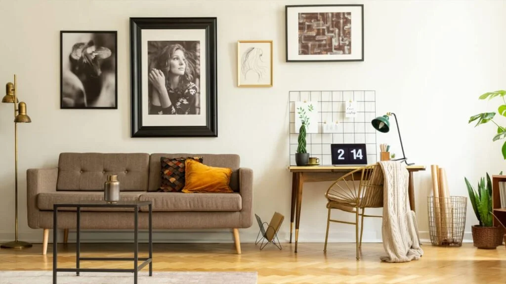
Choose the Right Scale for Your Wall
Scale is the number one mistake people make with blank wall decor ideas. A large, empty wall demands presence. Hanging a tiny frame in the center of a massive wall does not fill the space. Instead, it highlights the emptiness and makes the room feel unfinished.
Here is a counterintuitive truth: one large piece of art often looks calmer and more intentional than a cluster of small pieces. When considering wall art for living rooms, think big. A single statement piece anchors the room and gives your eye somewhere to rest.
Practical tip: Measure the wall and aim to fill roughly two-thirds of the width with your art or arrangement.
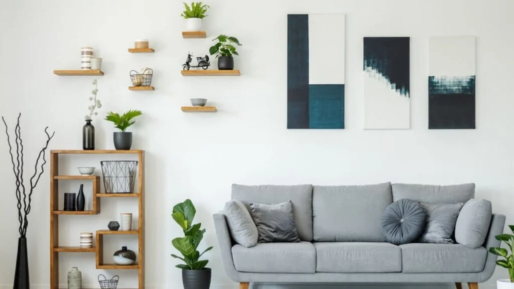
Let Negative Space Do Its Job
Negative space sounds like a design term reserved for professionals, but it simply means the empty areas around your decor. And those empty areas are not wasted space. They are intentional breathing room that makes everything else look better.
When you allow negative space to exist, your wall art gets the attention it deserves. Everything feels more purposeful and considered. Crowding pieces together, on the other hand, creates visual noise that exhausts the eye and makes a room feel cluttered, even if each individual piece is genuinely lovely on its own.
Practical tip: Leave at least 15 to 20 centimeters of empty space around wall art to let each piece breathe and shine.
Create One Focal Point Per Wall
A focal point is the visual anchor of a space. It is where your eye lands first and what you remember most about a room. Problems arise when you try to create multiple focal points on the same wall. Competing elements fight for attention, and the result feels chaotic.
When thinking about how to decorate blank walls, remember that a focal point is different from general decoration. A focal point commands the space. Supporting elements complement it without competing.
Practical tip: Ask yourself where your eyes land first when you enter the room. If you cannot answer clearly, you may need to simplify.
Use Wall Art to Add Personality, Not Noise
Wall art is one of the most personal choices you will make in your home. It reflects your taste, your travels, your memories, and your aesthetic sensibilities. The key is choosing pieces that genuinely resonate with you rather than following fleeting trends.
For small space wall decor, curated selections are especially important. Every piece needs to earn its place. Curated wall art brands like Jessie’s Home make this easier by offering collections designed to work together, taking the guesswork out of pairing styles and colors.
Practical tip: Choose art based on themes you already love, not trends. Your home should feel like you, not a showroom.
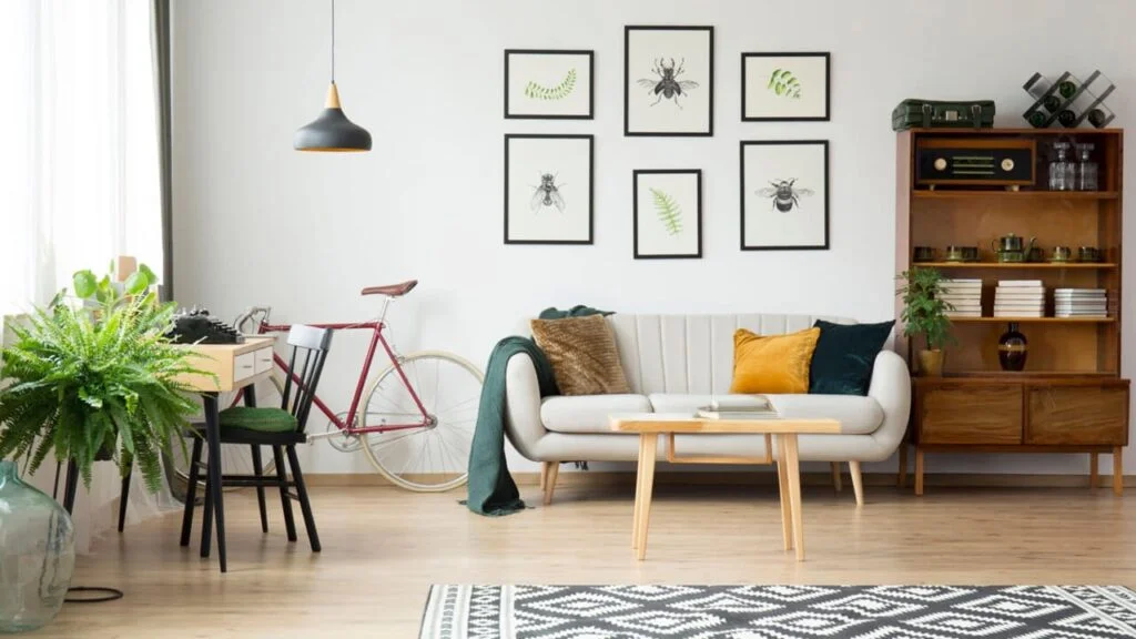
Think in Collections, Not Individual Pieces
One of the simplest ways to achieve decorating without clutter is to think in terms of collections rather than individual purchases. When pieces share a common thread, whether in color palette, subject matter, or artistic style, they create harmony rather than chaos.
This does not mean everything needs to match perfectly. It means finding the connective tissue between pieces. A collection of botanical prints, a series of black-and-white photographs, or a set of abstract works in complementary tones all create cohesion. You can browse complete wall art collections to see how thoughtful groupings can transform a space.
Practical tip: Stick to one color palette per wall. This instantly creates visual unity.
Height and Placement Matter More Than You Think
Even the perfect piece of art can look awkward and wrong if it is hung incorrectly. The most common mistake homeowners make? Hanging art too high. When artwork floats near the ceiling, it disconnects from the furniture below and makes the entire room feel strangely unbalanced.
The eye-level rule is your friend here. For most adults, this means the center of your artwork should sit roughly 145 to 150 centimeters from the floor. When hanging above furniture like a sofa or console table, leave about 15 to 20 centimeters between the top of the furniture and the bottom of the frame to create visual connection.
Practical tip: Hang art so the center sits at eye level for most adults. When in doubt, err slightly lower rather than higher.
Get Inspired, But Edit Ruthlessly
Inspiration is wonderful. Pinterest boards and design magazines are filled with gorgeous rooms that spark ideas. But here is the danger: inspiration overload leads to clutter. You save fifty ideas, try to incorporate all of them, and end up with a room that feels confused.
Good interior design tips always include the concept of editing. For a deeper understanding of how restraint creates impact, Architectural Digest’s guide to minimalist design principles explains how simplicity enhances rather than diminishes a space.
Practical tip: Save all the inspiration you want, then choose only one idea per wall. Be ruthless.
Embrace the Blank Wall
A blank wall is not your enemy. It is a canvas waiting for intention, not panic. When you approach decorating with purpose, proper scale, and thoughtful restraint, something wonderful happens: your space starts to feel calm, curated, and unmistakably yours.
Remember that empty space is not failure. Negative space is a deliberate design choice. One beautiful, well-chosen piece can do more for a room than ten mediocre ones fighting for attention. And the goal is never to fill every inch, but to create a room that feels balanced, inviting, and peaceful.
Trust your instincts, edit fearlessly, and give yourself permission to leave some walls a little more bare than you initially think you should. That restraint is not laziness. It is confidence. And confident, intentional spaces are the ones that truly feel like home.
FAQs
Focus on one main piece or cohesive collection and leave intentional negative space around it.
Often yes one large piece creates a calmer, more intentional look than many small items.
Negative space is the empty area around decor, and it helps artwork stand out while keeping the room visually calm.
The center of the artwork should sit around 145–150 cm from the floor, roughly at eye level.
Absolutely blank walls add balance and help other design elements feel more intentional.
Start with the mood you want the room to have, then select art that supports that feeling.
Use fewer pieces with strong impact and stick to a simple color palette to avoid visual overload.
Aim for at least 15–20 cm of space so each piece has room to breathe.
It should relate through color or style, but it doesn’t need to match perfectly to look cohesive.
Define the purpose of the room first and only buy pieces that clearly support that vision.


")


")


")