Color is one of the fastest ways to shift how a room feels. Before anyone notices furniture or art, the palette sets an emotional baseline. Warm tones can make a space feel social and energetic, while cool hues encourage calm and reflection. Neutral foundations help everything breathe. Understanding a few practical principles of color psychology lets you create rooms that support how you want to live, think, and rest.
Color Is an Emotional Cue, Not Just Decoration
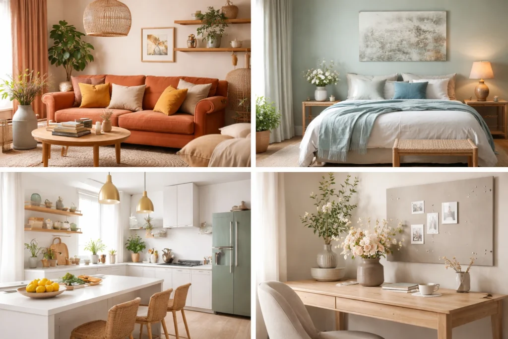
Color communicates before words do. Red, orange, and yellow often signal warmth, optimism, and activity. They are effective where you want conversation to spark and movement to flow, such as dining areas and casual living spaces. Blues and greens suggest stability, restoration, and clarity. They tend to work well for bedrooms, studies, and reading corners where focus or recovery is the goal. Purples and pinks can introduce sophistication or playfulness depending on saturation and pairing.
Intensity matters as much as hue. Saturated versions of any color make a louder statement and can energize a space quickly. Muted or grayed versions soften the experience and are easier to live with across seasons. If you love a strong color but fear overwhelm, consider it in controlled doses through textiles, small walls, or artwork rather than full room coverage.
Warm, Cool, and Neutral Palettes at Home
A warm palette leans on sunlit colors. Terracotta, coral, honey, and soft mustard create a welcoming, lived-in feeling. They pair naturally with wood, rattan, and brushed brass. A cool palette leans on sky and sea. Misty blue, eucalyptus green, slate, and soft teal promote ease and attention. They pair well with stone, linen, and matte black accents. You can balance either direction with neutrals that include greige, sand, taupe, oatmeal, and chalk white.
Neutrals are not an afterthought. They are the canvas that lets bolder choices resonate without crowding the senses. Select one stable neutral that recurs from room to room to tie the home together. Then allow supporting neutrals to vary slightly by space so each room has its own personality. This approach brings cohesion while avoiding monotony.
Light, Materials, and Scale Shape Perception
The same paint reads differently under morning sun, afternoon glare, or evening lamp light. North-facing rooms often benefit from warmer tones to counter cool daylight, while south-facing rooms can handle cooler palettes because sun warms them naturally. Always test large swatches at eye level and observe them across a full day. If a color looks perfect at noon but heavy at dusk, adjust one shade lighter or more muted.
Materials also influence perception. Matte finishes absorb light and calm bright hues. Gloss finishes bounce light and amplify color. Textures such as boucle, linen, sisal, and unfinished wood introduce natural variation that keeps even simple palettes interesting. Scale matters too. A saturated hue on a small accent wall might feel refined, while the same hue on four large walls could feel intense. Think about the size of the room, the height of the ceiling, and how much visual weight you are adding with each choice.
Use Flowers and Botanicals to Test Mood Shifts
Color experiments do not have to start with a paint roller. Fresh arrangements, dried stems, and potted greenery let you test how a palette affects the space before committing to bigger changes. Deep burgundy dahlias or jewel tone ranunculus can add drama to a neutral dining room. Cream roses and white orchids can soften a busy entry. Citrus poppies or marigolds can bring energy to a kitchen on overcast days. If you want a handcrafted approach that maps blooms to your décor, look to custom floral design in Larchmont NY as a model for pairing tone, texture, and scale so your arrangement interacts gracefully with wall color, textiles, and light.
When using florals as color studies, keep the surrounding surfaces simple. Clear or matte ceramic vessels support almost any palette. Place arrangements where natural light can highlight petals without causing heat stress. Replace stems seasonally to see how shifting daylight and foliage tones change the mood from spring to winter.
Room by Room: Practical Applications
Living Room. This is often a social hub, so aim for balanced energy. Choose a calm wall color that allows flexibility, then layer warm accents through throws, pillows, and art. Add a cooler note in one or two pieces to keep the room from feeling overly busy. If the room receives little daylight, add warmer lampshades and low, diffuse lighting to maintain softness.
Kitchen. Kitchens benefit from clarity and light. Crisp whites, soft grays, or pale sage keep surfaces feeling clean and open. Introduce vitality through small color doses such as fruit bowls, dish towels, and herb pots. If cabinetry is bold, keep counters and backsplash quieter so the palette feels intentional rather than crowded.
Bedroom. Treat sleep and restoration as the north star. Soft blue, muted green, or lavender-gray supports lower heart rate and gentle breathing patterns. Use texture to add interest without visual noise. Layering cozy elements like quilts, linen drapery, and cushions from sommier plus matelas pas cher can complete the story while enhancing comfort. Keep high contrast elements to a minimum.
Workspace. Aim for a palette that helps sustain focus without fatigue. Gentle neutrals with a cool undertone and a single accent color can cue attention during long sessions. A small plant or a weekly floral accent in a disciplined palette can prevent the area from feeling sterile while keeping distractions low.
Build a Color Plan You Can Live With
Create a simple palette map for the whole home. Choose a primary neutral that connects major spaces, two secondary hues for emphasis in different zones, and two accent colors for small moments. List where each will appear and how often. This tool helps you evaluate new purchases and prevents drift over time. When you bring something into the home, ask if it supports the map or if it belongs to a different story.
Revisit the plan seasonally. Early spring might call for lighter textiles and softer blooms, while autumn invites deeper tones and richer textures. Keep a small archive of paint chips, fabric swatches, and photos of arrangements that worked well. Over time you will see patterns that define your personal color language, making decisions faster and more confident.
Conclusion
Color is a quiet partner in the way you live. When you use it with intention, rooms support your goals and routines without calling attention to themselves. By understanding the emotional signals of warm, cool, and neutral palettes, respecting the impact of light and materials, and testing changes with small, reversible choices, you can shape a home that feels composed and alive. Thoughtful color is not about trend. It is about creating spaces that help you rest, focus, connect, and feel at home every day.
FAQs
Color psychology in home design refers to how different colors affect emotions, behavior, and overall mood within a space.
Soft blues, muted greens, and gentle lavender tones are known to promote calmness and relaxation.
Warm tones such as terracotta, coral, and soft yellows encourage conversation and a welcoming atmosphere.
Use bold colors in accents like pillows, artwork, or a single feature wall rather than covering the entire space.
Yes, natural and artificial lighting can significantly change how a color appears throughout the day.
Neutrals create balance, provide a cohesive base, and allow other colors to stand out without overwhelming the space.
Yes, cool tones and soft neutrals can improve focus and reduce fatigue in work environments.
Textures and finishes, like matte or gloss, affect how light interacts with color, altering its intensity and feel.
Apply large swatches on walls and observe them at different times of the day to see how lighting affects them.
Introduce color through flowers, textiles, artwork, and décor to experiment before making permanent changes.


