The difference between a room that feels considered and one that just feels correct is almost always light. Not the fixtures. The light itself.
There’s a particular quality to walking into a hotel lobby or a restaurant and immediately thinking: this place is nice. You haven’t looked at the menu. You haven’t touched anything. The furniture might be fairly ordinary. But something in the space has already communicated value, and you felt it within the first three seconds.
Most people attribute that feeling to the objects in the room — the materials, the brand, the fit and finish. Designers know better. What you’re actually reading, faster than conscious thought, is the lighting. How it falls. Where it comes from. What it chooses to show you, and what it lets disappear into dark.
This is not a technical article about lumens or fixture specifications. It’s about the perceptual mechanics behind why some spaces feel one way and others feel like fluorescent waiting rooms — even when the underlying room is essentially the same.
The Illusion of a ‘Clean’ or ‘Expensive’ Space
The brain doesn’t experience a space objectively. It builds a model of it using whatever information the eyes provide — and light controls what information that is. A room lit evenly from above with flat, cool-white light gives you everything at once, all at equal value. Nothing is emphasized. Nothing recedes. The space reads as complete information, which the brain processes as: ordinary.
A room with carefully placed warm light, on the other hand, is withholding information on purpose. Corners are dark. The ceiling might be entirely absent from your perception. What you see is a selection — the table surface, the objects on it, the texture of one wall — and your brain fills in the rest with what feels likely. Controlled mystery reads as intentionality. Intentionality reads as quality.
Controlled mystery reads as intentionality. Intentionality reads as quality.
This is why a single well-placed floor lamp can make an Ikea sofa feel more expensive than it is, while that same sofa under an overhead LED panel just looks like what it is. The object didn’t change. The light changed what story the room is telling about the object.
How Lighting Changes Perception — Not Objects
There’s a reason high-end retail environments spend serious money on lighting design before they spend it on fixtures. The lighting isn’t decorating the space — it’s actively directing attention, creating a sequence, and shaping how long a person dwells in any given spot.
Color temperature is the most immediate variable. Warm light — roughly 2700K to 3000K — creates a quality that most people associate with comfort, safety, and privacy. It’s the color range of candles, of incandescent bulbs, of a kitchen at dinner. Cooler light, around 4000K and above, signals alertness, precision, and neutrality. Neither is inherently better. The problem is when a space uses cool overhead light as its primary source and then tries to achieve warmth through textiles and wood tones. The surfaces are warm but the air is cold. The conflict is subtle but persistent.
Glossy surfaces and matte surfaces respond to light completely differently, and rooms that use both create a natural hierarchy that matte-only rooms can’t achieve. A gloss-lacquered cabinet will pick up and redistribute warm light in a way that makes it feel alive. A matte linen sofa beside it absorbs that same light and grounds the scene. The contrast isn’t decorative — it’s perceptual structure. Your eye knows where to go.
Textured walls are the underused tool in this conversation. A flat painted surface under directional light looks fine. The same surface in unpainted plaster, raw concrete, or even a heavy linen wallcovering reveals itself under that same light — the texture catches and holds shadow, giving the wall depth and presence it didn’t have before. This is why some spaces feel rich even when they’re materially austere. The walls are doing work that smooth surfaces simply can’t.
The Role of Contrast and Shadows
Most residential lighting is designed to eliminate shadows. That’s understandable — shadows mean uneven illumination, and uneven illumination used to be a practical problem. But shadows are also the primary tool through which three-dimensionality is communicated visually. A space without shadows is a space without depth.
In practice, the spaces that feel most considered — hotel rooms, high-end restaurants, well-designed apartments — use shadows intentionally. Not darkness exactly, but the controlled absence of light in places where the eye doesn’t need to go. The shadow under a floating shelf isn’t a failure of illumination. It’s the visual signal that the shelf is floating.
A space without shadows is a space without depth. Shadows aren’t a problem to solve — they’re a tool.
Eye-level lighting versus ceiling-only lighting is where this distinction becomes most practical. When all light originates from above, shadows fall downward and the room reads as institutional — it’s the geometry of offices and hospitals. When some portion of the light comes from eye level or below — table lamps, sconces, floor lamps, objects with their own light — shadows become lateral and complex. The room suddenly has multiple light sources competing gently with each other, and that competition creates visual interest that no single overhead fixture can produce.
Why Flat Lighting Kills Atmosphere
The technical term for it is ‘overlighting,’ but the experiential term is closer to: everything is visible and nothing is interesting. A room lit to 500 lux uniformly across all surfaces is a room that’s been solved. There are no questions left to ask, no corners to wonder about, no quality of light changing as you move through the space.
Atmosphere requires incompleteness. It requires the brain to participate in constructing the experience rather than simply receiving it. This is why candlelight feels romantic even in objectively uncomfortable settings — the inconstancy, the warmth, the way it makes objects appear and disappear — all of that is the brain working to build the scene, and that effort creates investment.
Flat lighting also does something specific to faces: it erases them. Directional light creates the shadows that give a face structure and expression. Under flat overhead light, faces look tired and flat regardless of how the person actually looks. Spaces designed for social interaction — restaurants, bars, living rooms — benefit enormously from lighting that flatters the people inside them. This isn’t vanity. It’s hospitality.
The balance point that works for most residential and light commercial spaces is roughly this: ambient light low enough that you can feel the shadows, supplemented by task or accent light at the points where you actually need clarity. That gap between the ambient level and the accent level — the contrast ratio — is where atmosphere lives.
Where Modern Neon Lighting Fits Into Interiors
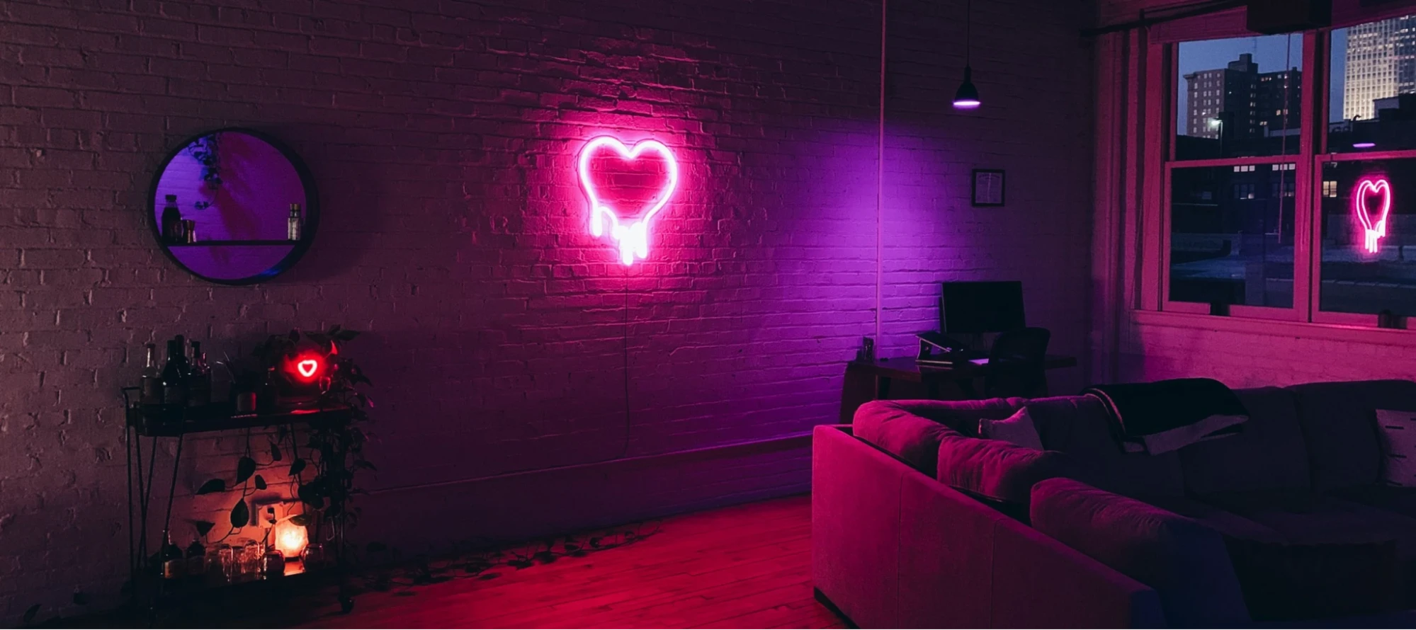
For a long time, neon existed at the edges of interior design — associated with storefronts, dive bars, and urban night streets. It was loud light, unsubtle light, light that announced itself. That’s changed considerably, and not just because the medium changed.
Contemporary LED neon — the flexible, low-heat, energy-efficient version of the traditional glass-tube original — produces a quality of light that sits at a particular sweet spot: warm enough to feel analog, vivid enough to register as a focal point, but diffused enough not to glare. Mounted on the right wall at the right distance, it contributes to a room’s light the way a well-placed lamp does: not as a task source, but as ambience with intention.
What makes it genuinely useful in interior design terms is the eye-level positioning it encourages. A neon installation on a wall is almost always experienced at or near human eye level — which immediately addresses the ceiling-dominant light problem that plagues so many residential and commercial spaces. The light source is where people are, not above them looking down.
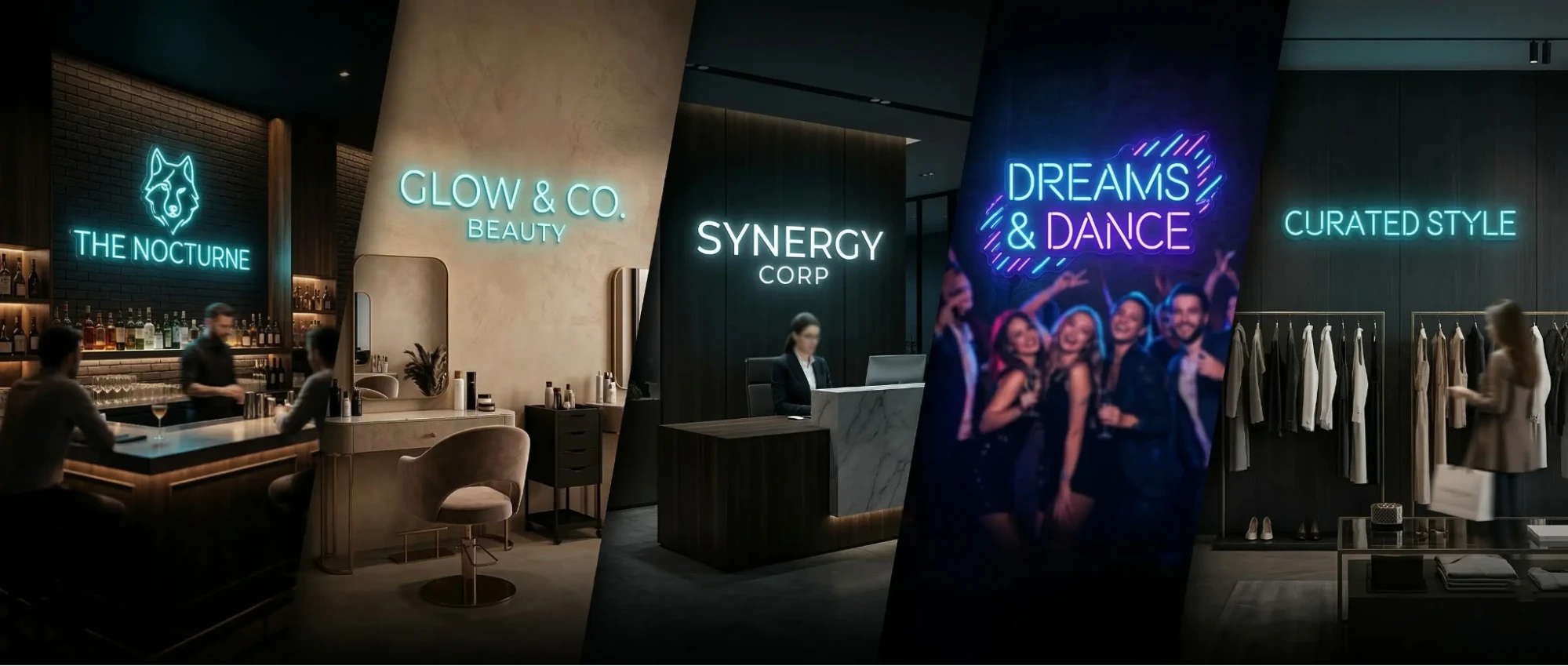
The best applications aren’t necessarily the most obvious ones. It’s not always a bold script word on a restaurant wall. Sometimes it’s a soft architectural line running behind a bar counter, or a single curved form in an alcove that makes the alcove feel designed rather than leftover. The modern neon lighting pieces being produced now range from typographic to purely sculptural, which gives designers room to integrate the medium without making the neon the point of the room.
One thing worth noting: neon light interacts with surrounding surfaces in interesting ways. On a raw brick wall, it scatters. On a smooth plaster surface, it reflects cleanly. On a dark painted wall, it floats. These are material conversations worth having before you commit to a position, because the same piece will read differently depending on what’s behind it.
Subtle Ways Designers Use Light as Identity
The spaces that are hardest to describe — the ones you remember without being able to say exactly why — are usually the ones where light has been used as a design material rather than a utility. Light has been given the same consideration as the furniture, the flooring, the color palette. It has a point of view.
This shows up in small ways. A restaurant where the lighting gets slightly warmer as the evening progresses. A retail store where the changing rooms are lit at a different color temperature than the floor — warmer, more flattering — so that the moment of decision happens in the best possible light. A home where the living room shifts from working-daylight in the afternoon to amber near-candlelight by 9 p.m., not because anyone adjusted a setting but because the layered fixtures do that naturally.
Light as identity also means understanding that a space’s lighting tells visitors something about who you are before you say anything. A home with a single, precisely chosen custom neon element for interiors — used deliberately, not decoratively — communicates something about the person who lives there. Not just aesthetic preference, but a relationship with the designed environment. An understanding that the objects and light in a space are in conversation with each other.
The broader point is this: anyone can renovate a surface. Paint a wall, replace a sofa, add a plant. But the spaces that genuinely feel different — elevated, considered, expensive without necessarily being expensive — are the ones where someone thought carefully about where the light comes from, where it goes, and what it illuminates on the way there. That thinking doesn’t require a large budget. It requires attention, which turns out to be the harder thing to supply.
The next time you walk into a space and feel something — ease, calm, intrigue, warmth — before you’ve consciously processed a single object, you’re experiencing someone’s lighting decisions. Most of the time, you’ll never know whose. That’s usually the sign they got it right.
FAQs
Spaces feel expensive primarily because of how light is used to create contrast, depth, and focus—not because of the furniture itself.
Lighting controls what the eye sees first, what fades away, and how the brain interprets the space as intentional or ordinary.
Not necessarily—warm lighting creates comfort and intimacy, while cool lighting supports clarity and focus; the key is using them intentionally.
Ceiling-only lighting removes shadows and depth, making everything equally visible and reducing visual interest.
Shadows add dimension and mystery, helping objects feel layered and giving the space a more designed, intentional look.
Eye-level lighting comes from lamps or wall fixtures and creates more natural, engaging shadows compared to overhead light.
Yes—well-placed lighting can highlight textures and hide imperfections, elevating the overall perception of the furniture.
Warmer temperatures feel cozy and relaxed, while cooler tones feel more clinical and alert, influencing how a room is experienced.
Modern LED neon adds eye-level ambient light and visual interest, often acting as a subtle focal point rather than just decoration.
Overlighting a space evenly, which removes contrast and atmosphere, making the room feel flat and uninviting.


