Some houses disappear when the sun goes down. Others come alive.
You’ve seen it. A quiet street at night, and one home instantly draws your attention—not because it’s brighter, but because it’s designed to be seen. That’s the difference. Homes look better lit at night when lighting is intentional, layered, and psychologically appealing—not just bright.
I’ve worked around enough exterior designs to notice a pattern. The best-lit homes don’t rely on more fixtures. They rely on smarter placement. Even professionals like a Hinsdale Christmas light installation company follow the same principle: design first, lights second.
So what actually makes some homes stand out after dark?
Let’s break it down.
The Psychology Behind Why Homes Look Better Lit at Night
How Lighting Influences Perception
Lighting is emotional. It tells your brain how to feel before you even realize it.
Warm lighting—soft yellows and ambers—creates comfort. It feels welcoming, safe, and lived-in. Cooler lighting, on the other hand, can feel modern but sometimes sterile if overused.
When homes look better lit at night, it’s often because they strike that balance. They feel inviting without being overwhelming. Bright enough to see. Soft enough to stay.
Think about it: would you rather walk up to a home that glows gently or one that blasts harsh white light across the entire yard?
Exactly.
Contrast Creates Visual Interest
Flat lighting kills interest. It removes depth and makes everything look… average.
Contrast is what brings a home to life. Light against shadow. Bright against dark. Highlighted features against subtle backgrounds.
Without contrast, even the most beautiful architecture disappears at night.
The Role of Depth and Dimension
Depth is what separates amateur setups from professional ones.
Layered lighting—foreground, midground, background—adds richness. It creates a sense of space. It lets your eye move naturally.
When homes look better lit at night, it’s rarely because everything is lit equally. It’s because some areas are emphasized, while others are intentionally left in shadow.
That’s not a flaw. That’s design.
Core Design Principles That Make Homes Look Better Lit at Night
1. Contrast: The Secret to Visual Drama
Contrast is your best tool. Use it well, and your home instantly feels more refined.
Here’s how:
- Highlight vertical elements like columns or walls
- Leave surrounding areas slightly darker
- Use uplighting to create shadow patterns
Example:
- A floodlight pointed at your entire facade = flat
- A focused uplight on stonework or siding = dramatic
When you control contrast, homes look better lit at night without needing more fixtures.
2. Focal Points: Guiding the Eye
Every well-lit home has a focal point. Sometimes more than one. But always intentional.
Without a focal point, your lighting feels scattered.
Common focal points include:
- Front entryway
- A large tree
- Unique architectural features
- Garage framing or driveway edges
Here’s a quick guide:
| Area | Why It Works | Lighting Approach |
| Entryway | First impression | Soft, warm lighting |
| Trees | Adds height and drama | Uplighting |
| Rooflines | Defines structure | Linear lighting |
| Pathways | Guides movement | Low, consistent lights |
When you guide the eye, homes look better lit at night because they feel organized, not random.
3. Symmetry and Balance
Symmetry is powerful. It feels complete. Stable. Intentional.
If your home has a centered door, balanced windows, or matching features—lean into that.
- Place matching lights on both sides of the entry
- Keep spacing consistent
- Mirror design choices where possible
But here’s the twist.
Perfect symmetry isn’t always required. Sometimes a single focal tree or feature breaks symmetry in a good way. The key is balance, not perfection.
Still, when done right, symmetry is one of the main reasons homes look better lit at night.
Lighting Key Areas That Transform a Home at Night
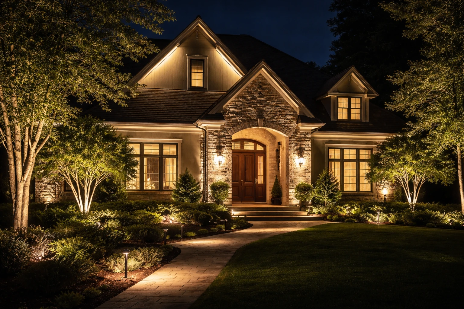
Rooflines and Architectural Edges
Rooflines define your home’s shape. At night, they disappear—unless you highlight them.
Subtle lighting along roof edges or peaks can:
- Emphasize structure
- Add clarity from a distance
- Make your home look larger
You don’t need bright strips everywhere. Just enough to outline the form.
Trees and Landscaping
This is where magic happens.
A single tree, properly lit, can transform your entire yard.
Use uplighting at the base. Let the light travel upward. Watch how shadows from branches create texture and movement.
Landscaping adds depth. It fills the space between your home and the street.
That’s one of the fastest ways homes look better lit at night—by not focusing only on the house itself.
Entryways and Pathways
Your entryway sets the tone.
Too dark? It feels uninviting.
Too bright? It feels harsh.
Aim for:
- Warm lighting near the door
- Soft pathway lights guiding the way
- Even spacing to avoid visual clutter
A well-lit path doesn’t just look good. It feels safe. And that feeling matters.
Layering Light: The Difference Between Amateur and Professional Results
Ambient, Accent, and Task Lighting Explained
Professional lighting uses layers. Always.
- Ambient lighting: Overall glow
- Accent lighting: Highlights features
- Task lighting: Functional areas (like paths)
Most homeowners rely on just one layer. That’s the problem.
How Professionals Combine Layers
Here’s what a layered setup might look like:
- Ambient: soft wash across the facade
- Accent: uplights on trees and columns
- Task: pathway lights leading to the entrance
Each layer plays a role. Together, they create depth.
That’s why homes look better lit at night when designed by professionals—or by homeowners who think like them.
Common Mistakes Homeowners Make
Let’s be honest. These happen all the time:
- Installing too many lights
- Pointing lights directly at eye level
- Ignoring shadows completely
- Using inconsistent color temperatures
More lights ≠ better results.
Smarter placement always wins.
Why More Lights Don’t Always Mean Better Results
There’s a common belief: if it’s not working, add more lights.
That’s usually the wrong move.
Overlighting creates:
- Glare
- Visual clutter
- Loss of contrast
- A washed-out appearance
Instead of enhancing your home, it flattens it.
Restraint is what makes lighting feel high-end. When you scale back and focus on key areas, homes look better lit at night—cleaner, sharper, more intentional.
How Christmas Lighting Follows the Same Principles
Design vs Decoration
Holiday lighting is where many homeowners go all-in—and lose the plot.
Throwing lights everywhere doesn’t create beauty. It creates chaos.
Even festive setups need structure.
Using Focal Points During the Holidays
Focus on:
- Rooflines
- Entryways
- One or two standout trees
When you apply focal points, your display feels polished instead of overwhelming.
Creating Cohesion Instead of Chaos
Here’s what works:
- Stick to a consistent color palette
- Keep spacing even
- Use symmetry where possible
When done right, holiday setups prove the same point: homes look better lit at night when lighting follows design principles—not just enthusiasm.
Real-World Examples of Homes That Look Better Lit at Night
Let’s compare.
Before:
- One bright porch light
- Dark yard
- No focal points
After:
- Uplighting on two trees
- Soft lighting along the path
- Warm entry lighting
Same home. Completely different feel.
Or another:
Before:
- Floodlights washing the entire facade
After:
- Targeted lighting on columns
- Subtle roofline highlights
- Dimmer ambient lighting
The second version feels more expensive. More intentional.
That’s how homes look better lit at night—not through cost, but through design choices.
Practical Tips to Make Your Home Look Better Lit at Night
Start simple. Then build.
Actionable Steps:
- Start with one focal point
Pick your entryway or a tree. Make it stand out. - Use warm lighting tones
Aim for 2700K–3000K for a welcoming feel. - Highlight structure, not just space
Focus on lines, edges, and textures. - Test at night and adjust
Lighting always looks different after dark. Walk outside and refine. - Invest in quality fixtures
Cheap lights often create uneven results.
Quick Checklist
Use this before finishing your setup:
- Do I have a clear focal point?
- Is there contrast between light and shadow?
- Are my lights evenly spaced?
- Am I avoiding overlighting?
- Does the setup feel balanced?
If you can say yes to most of these, you’re on the right track.
Conclusion
Great lighting isn’t about brightness. It’s about intention.
Contrast creates drama. Focal points guide the eye. Symmetry brings balance. Layering adds depth. And restraint ties it all together.
That’s why some houses quietly stand out while others fade into the background.
When you apply these principles—even in small ways—homes look better lit at night. Not because they have more lights, but because they use them better.
And that’s the real difference.
FAQs
Because they use intentional lighting design with contrast, focal points, and balance instead of simply adding more lights.
Warm lighting (2700K–3000K) creates a cozy, welcoming feel that most homeowners prefer.
Contrast adds depth by combining light and shadow, making architectural features stand out.
The entryway is usually the most important since it creates the first impression.
No, selective lighting is better—highlight key areas and leave some spaces in shadow for depth.
Use uplighting on trees and shrubs to create height, texture, and visual interest.
Yes, symmetry creates a balanced and polished look, especially around doors and windows.
Overlighting reduces contrast and creates glare, making the home look flat and cluttered.
Layering ambient, accent, and task lighting adds dimension and makes the space feel more dynamic.
Yes, Christmas lighting looks better when it uses focal points, symmetry, and consistent spacing.


