A beautifully designed bathroom can make a world of difference in how a home feels. For many, the bathroom is where the day starts and ends, so it deserves as much care and attention as any other room. What’s more, even if the space is compact, it can still reflect refinement and personal style. With the right design elements, a small bathroom can transform from purely functional to quietly indulgent—a place that feels both restorative and sophisticated.
Truly, size shouldn’t dictate style. It’s entirely possible to introduce a sense of luxury even in the smallest spaces, and colour plays a crucial role in achieving that effect. The tones you choose can alter someone’s perception of scale, light, and texture. Soft shades can make the space appear larger, while deeper hues can create intimacy and depth. In short, when you use colour intentionally, you can give your bathroom a polished look that feels inviting rather than crowded.
Have you been wanting to execute a bathroom renovation Auckland residents will envy? This article explores colour schemes that can make a small bathroom look and feel luxurious. Each approach gives you a unique way to enhance the space, whether your taste leans toward clean minimalism or something more warm and textural. Let’s take a look:
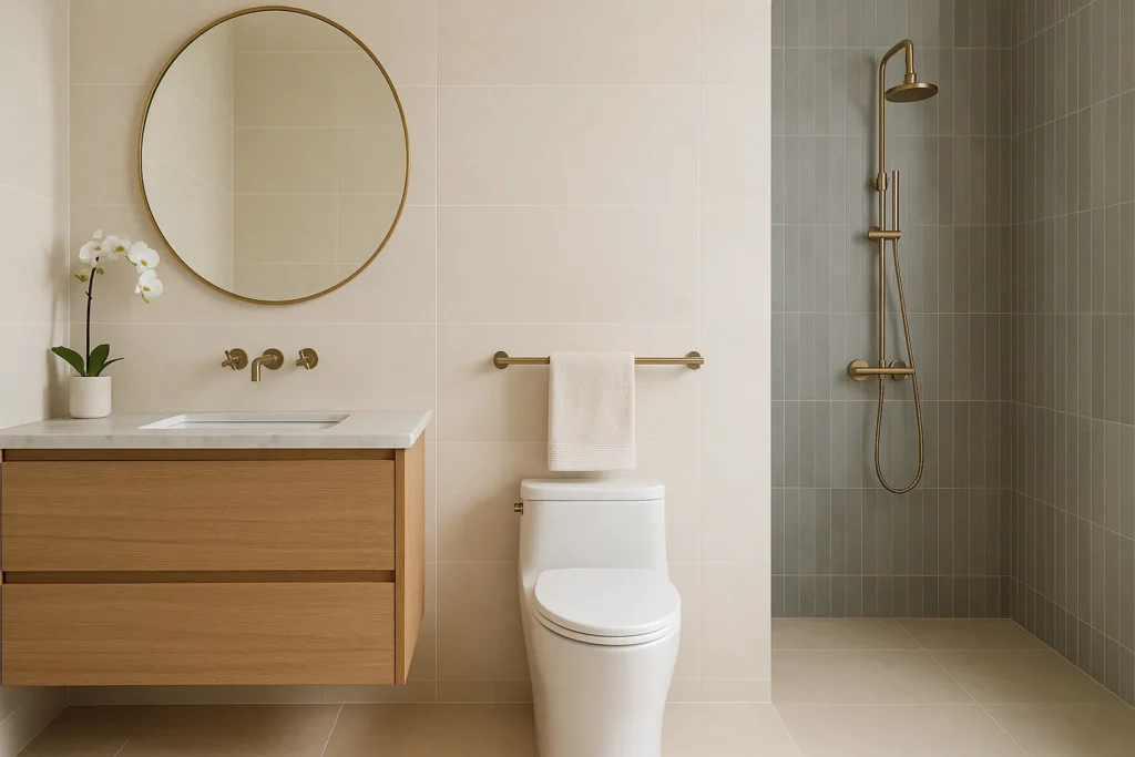
Soft Neutrals with Metallic Accents
Neutral colours are a classic starting point for a small bathroom, as they can make the space feel more open. Shades such as ivory, warm white, and beige work beautifully as a base, reflecting light to create the illusion of more space. The key to making them look luxurious lies in the details. For instance, polished brass or brushed gold fittings add warmth and contrast. Consider combining matte tiles with glossy finishes for visual depth and layering as well, to create an understated elegance that’s both timeless and modern.
Monochrome Minimalism
Few combinations feel as effortlessly sleek as black, white, and grey. A monochrome palette works best when it’s not overly stark; softening the contrast with mid-grey tones can make it feel less severe while maintaining its clean, modern edge. To ground the look and introduce definition without overwhelming the space, pick matte black fixtures. Then, vary the finishes: think textured wall tiles, stone-effect floors, or a subtle pattern in the shower area. The result is a bathroom that feels balanced, contemporary, and quietly confident.
Cool Spa Blues and Whites
For a fresh, tranquil atmosphere, look to the soothing tones of water. Soft blues paired with crisp whites create an instantly relaxing effect, reminiscent of a boutique spa. These colours also enhance brightness, especially in smaller bathrooms that rely on artificial lighting. Chrome or silver accents complement the cool tones and add a touch of shimmer without distraction. To keep the palette cohesive, limit strong contrasts and stick to simple accessories in natural or neutral finishes. The overall effect is clean, refreshing, and easy to maintain, ideal for anyone wanting a calm retreat at home.
Marble Tones and Warm Greys
Marble-inspired tones instantly signal elegance. Soft grey veining against white or cream creates visual movement that feels organic rather than busy. For smaller bathrooms, large-format tiles can make the room appear more seamless by reducing grout lines and drawing the eye outward. Meanwhile, warmer greys or greige hues work well alongside natural stone textures and help to balance the coolness that marble sometimes brings. You don’t even need genuine marble to achieve this look, as high-quality porcelain alternatives can deliver the same polished effect while being easier to maintain. You’ll get a timeless, hotel-like atmosphere that feels indulgent yet uncluttered.
Earthy Luxe
Earth-toned palettes can make small bathrooms feel comforting and grounded, but still refined. Think clay, sand, or soft olive paired with light stone or wood accents, which evoke warmth without making the space feel heavy. Textured materials such as microcement or matte tiles can add depth and interest, especially when balanced with smooth finishes on fixtures or mirrors. This scheme works particularly well if you want a calm, spa-like setting that connects with natural elements.
Jewel Tones with Brass
Want a bolder take on luxury? Jewel tones such as emerald, navy, or deep teal are strikingly sophisticated. When used thoughtfully, these colours can bring a rich, dramatic flair without being overpowering. The secret is moderation; limit strong hues to one main feature, like a statement wall, vanity, or cabinetry. Balance these darker shades with warm brass or gold accents to introduce light and contrast. The interplay between matte depth and metallic sheen adds richness and texture so your space feels high-end, even if it’s compact.
Blush and Warm Neutrals
If you want a gentle yet elegant look, muted blush tones paired with warm neutrals like ivory or taupe can make a bathroom feel sophisticated without leaning overly feminine. This palette reflects light softly, giving the space a delicate glow. Subtle accents in rose gold or brushed brass add cohesion and warmth, while textured finishes such as linen-look tiles or matte paint prevent the colours from appearing flat. It’s a balanced design that feels calm, cohesive, and quietly indulgent, presenting a contemporary take on understated luxury.
Conclusion
Creating a luxurious bathroom isn’t about size or extravagance; it’s about intention. The right colour palette can elevate even the smallest spaces and transform them into areas of calm and beauty. When you design thoughtfully, every shade and surface contributes to a feeling of quiet refinement that lasts well beyond first impressions.
FAQs
Soft neutrals, marble tones, and jewel hues can all create a sense of elegance—choose based on your desired mood and lighting.
Light shades like ivory, beige, and white reflect more light, making the space feel open and airy.
Yes, when balanced with good lighting and metallic accents, deep tones like navy or emerald can add drama and sophistication.
Brushed gold, polished brass, and chrome accents instantly elevate the overall design.
Absolutely—mixing finishes adds depth, contrast, and a layered, high-end appearance.
Use calming tones such as soft blues and whites, natural textures, and minimal accessories.
Yes, especially large-format marble or marble-look tiles, which create seamless flow and timeless elegance.
Earth tones like sand, olive, or clay pair beautifully with wood for a grounded yet refined effect.
Limit dark or strong colours to one feature wall or focal point and balance them with light neutrals.
Blush paired with warm neutrals like taupe or ivory achieves a subtle, sophisticated balance.